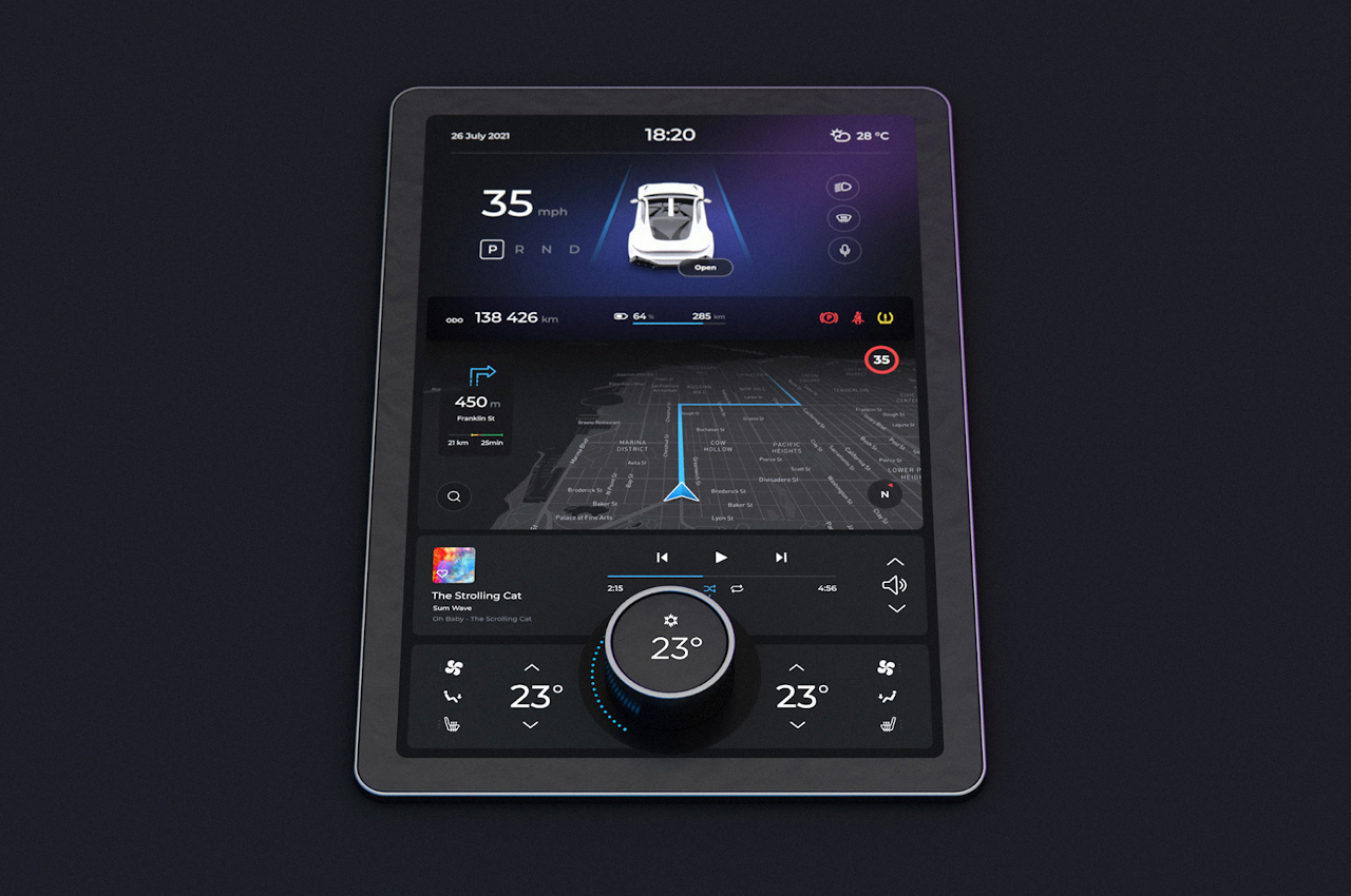
A movable knob puts a tactile twist on the modern touch screen car dashboard
Encrypting your link and protect the link from viruses, malware, thief, etc! Made your link safe to visit.
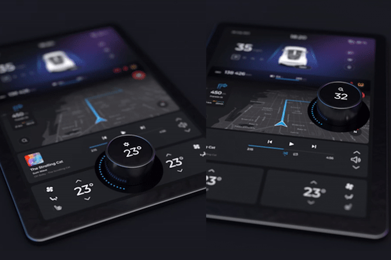
Touch screens are great and all, but they aren’t always the best solutions for controlling things, especially when you need to keep one hand on the dash and both eyes on the road.
The cars of the future are imagined to have almost no physical controls. They might not even have steering wheels if the promise of self-driving vehicles gets fulfilled perfectly. Buttons and knobs will be a thing of the past, replaced by slick screens you can simply glide your finger on. Reality, however, still needs to catch up with our imaginations, and our fingers and hands are still critical in how we interact with cars.
Designer: Gabor Jutasi
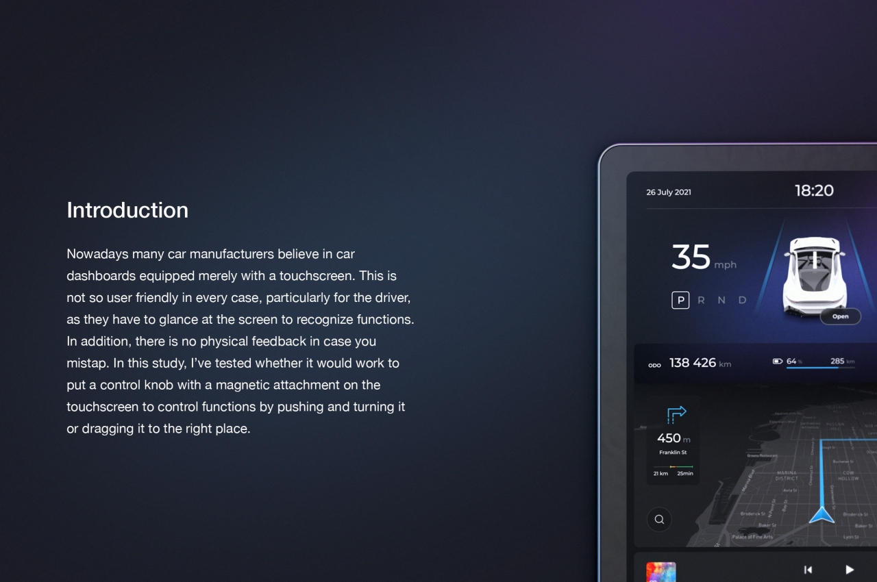
Touch screens provide more controls and functionality in a small amount of space, while buttons, dials, and switches are not only limited functionality but also restricted by the laws of physics. Until we finally make tactile touch screens a reality, however, there is one thing that physical controls can do that touch screens can’t provide. More often than not, you don’t have to look at a button to know that it’s on or off, nor do you have to look at a dial when twisting its knob.
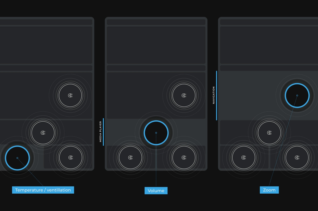
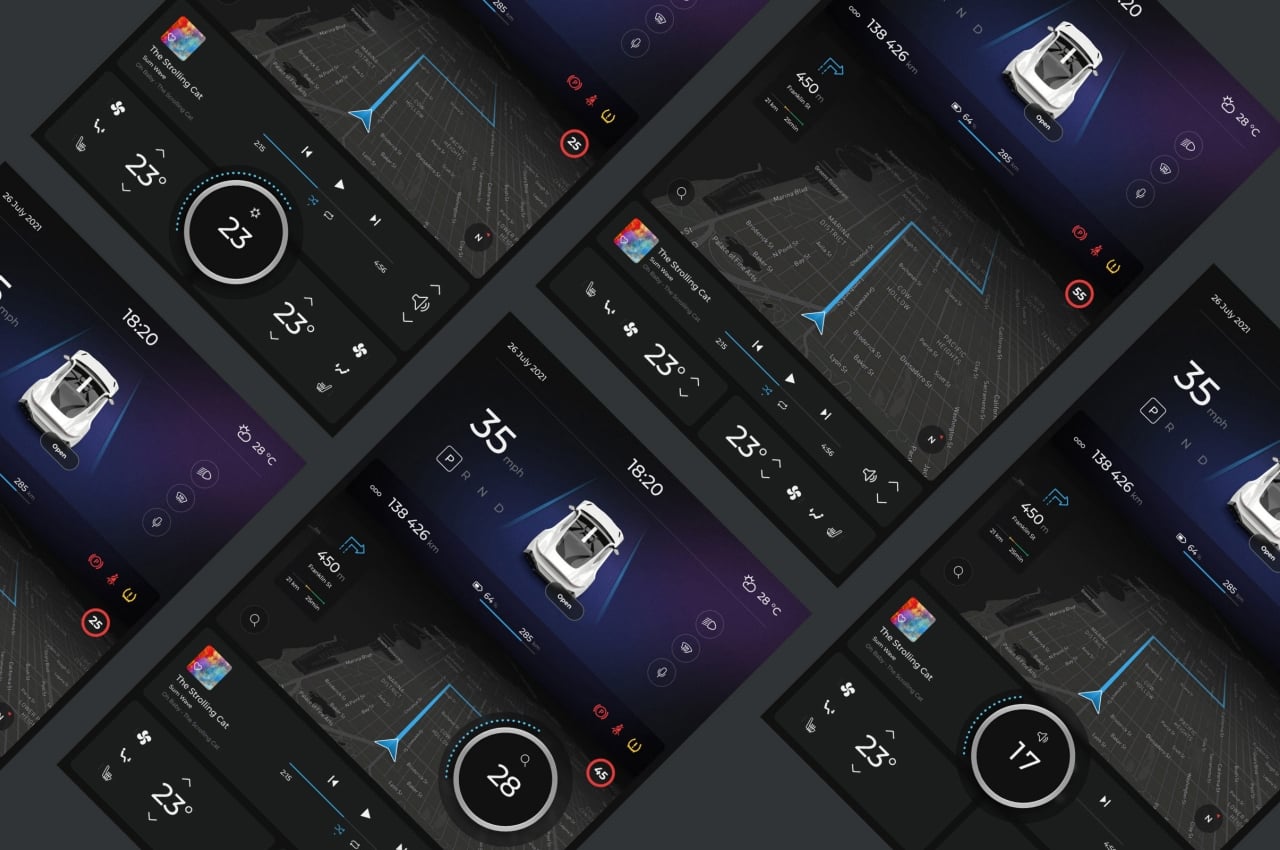
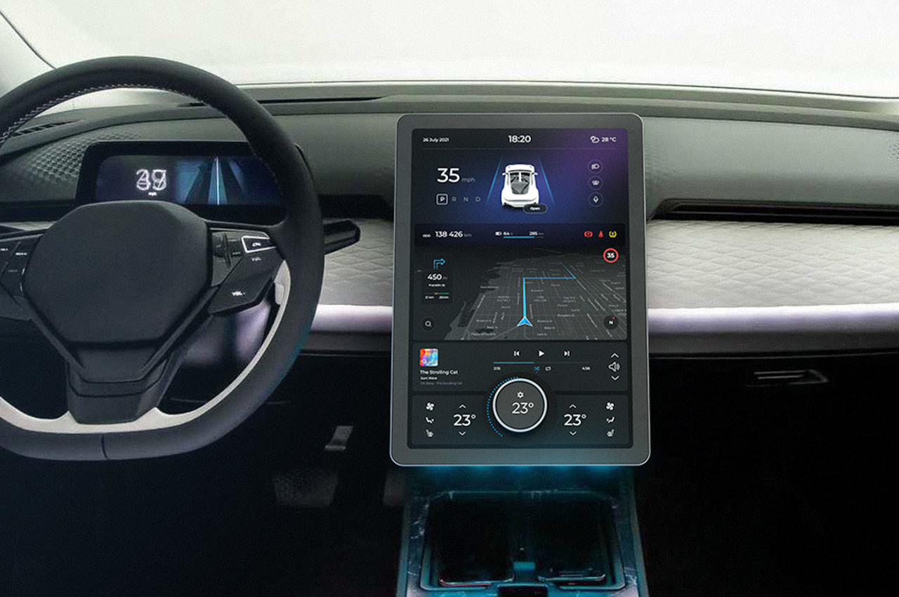
This “no look” functionality is critically important when driving, where your eyes should be on the road, not the touch screen. At the same time, we can’t feasibly turn back the clock on car dashboards, so we need a compromise that takes these needs and limitations into account. Enter the Electric Car Dashboard, where a simple, movable knob does the trick.
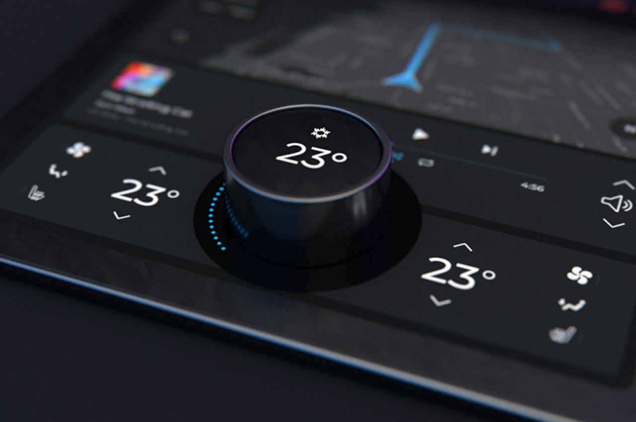
Actually, that knob is anything but simple and is a sophisticated device on its own. It has a dynamic display on the top that changes its content depending on where you place it on the dash. It also acts as a button you can push to access more functionality that would otherwise require a second knob.

The idea is that this dial gives drivers the necessary physical control they can turn in order to adjust the volume or the temperature without even looking at the screen. The knob’s function isn’t fixed, however, and you can move it to a different portion of the screen to make it control a different setting, like skipping to the next or previous track in a playlist. And in case there’s more than just one setting in that position, you push the knob’s button to switch to the next set.
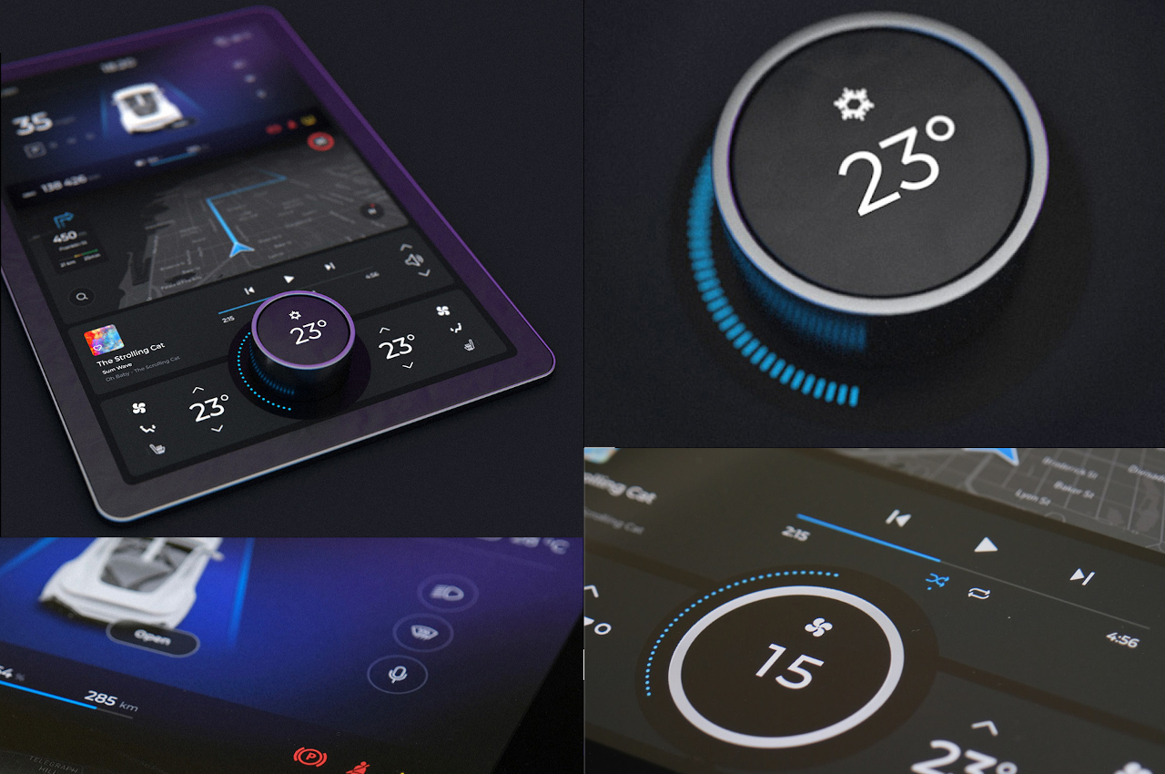
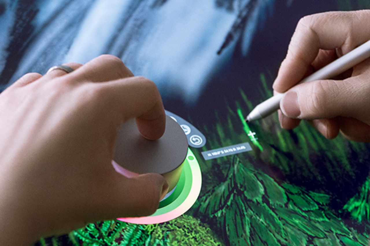
This kind of multi-functional dynamic knob isn’t just a concept, though. Microsoft already demonstrated this in action with the Surface Dial. Of course, there are plenty of things to iron out with this Electric Car Dashboard concept, and it isn’t a foolproof solution either. It is, however, a very interesting one that creatively combines the digital and the physical in a way that doesn’t compromise one or the other.
The post A movable knob puts a tactile twist on the modern touch screen car dashboard first appeared on Yanko Design.


0 Response to "A movable knob puts a tactile twist on the modern touch screen car dashboard"
Post a Comment