Buckets and Buckets of Knobs With Peloton Head of Industrial Design Jason Poure
Encrypting your link and protect the link from viruses, malware, thief, etc! Made your link safe to visit.
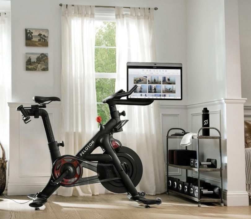
Beyond video conferencing via Zoom, there may be no brand more synonymous with the shift in habits many of us made during the pandemic as Peloton. The brand’s connected fitness bike revolutionized the stationary bike category, pairing sleek hardware with live-streaming instructor-led programs to coax legions of devoted riders to pedal away from the comforts of their own home (note, Peloton has actually been around for about a decade now).
While those halcyon days of sales in 2020 – when gyms were closed and Peloton raced ahead as the at-home workout du jour – proved to be a period of downhill coasting, today Peloton finds itself battling an uphill grind, a victim of yet another change in course as people return to reopened gyms, demand for premium home fitness equipment softens, and a new generation of copycat competitors have sprung forth offering various modes of movement – rowers, climbers, resistance weight trainers, and other stationary bikes – each drafting off the details and features that initially convinced millions to invest in working out from home.
Even so, Peloton’s endurance as the preeminent brand within the connected fitness realm remains strong. While they’ve continued to diversify their catalog of equipment – including a treadmill, and most recently a wearable optical heart rate monitor – their cardio bikes remain the cornerstone of the Peloton experience, with their top-of-the-line Bike+ the most premium expression of the brand’s “whenever you want it” ethos.
Peloton’s success is partially attributable to the fact they designed a piece of exercise equipment that wasn’t just acceptable for the home, but aesthetically welcomed to live prominently within spaces great and small, no small feat considering exercise equipment is usually relegated to spaces out of view. We spoke with Jason Poure, Peloton Head of Industrial Design to gain further details about what goes into making a Peloton product.
The home stationary exercise bike was something of a standardized form before the appearance of the Peloton Bike. Could you explain what sets the Peloton bikes apart from that predecessor, both as a physical object and also as an experiential medium of movement?
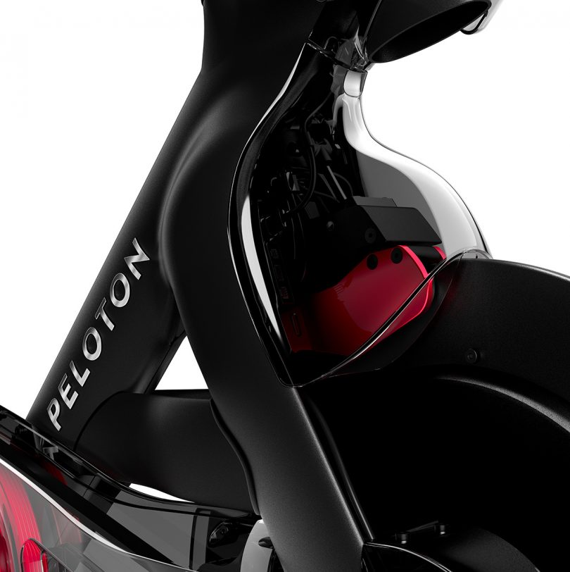
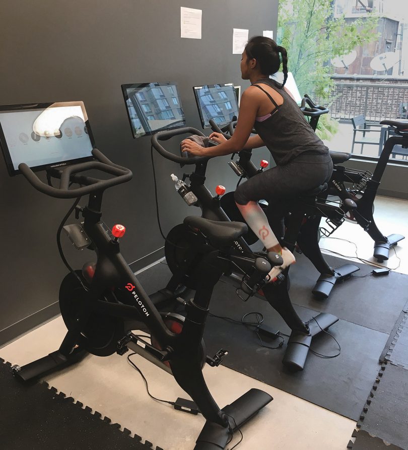
We began with the idea the Bike+ would be a sculptural object, a design rooted in emotion. A lot of the original frame elements are sculptural – for example, you can follow sculpted shoulders leading down into the forks, something that you wouldn’t see on a traditional spin bike.
Our goal was to design an object of desire that’s been created with form as part of the purpose, focusing on three main values: 1. honesty, 2. being personal, and 3. including an element of the dynamic. In the case of honesty, what I’m referring to is the physical execution and choice in materials. We used a monocoque construction rather than using a sub-frame with add-on plastics like other bikes; it was a decision reflecting honesty in regards to which materials we’d use and where, all to create form and function in the same gesture.
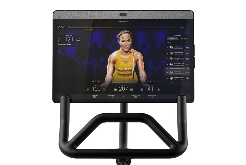
Another example is the 24” HD rotating tablet touchscreen. We always wanted to integrate textiles onto the back as a visual and textural detail, but we also wanted to make sure there was a purpose and reason for it to be there. As designers we like textiles… we think textiles are cool and we’re inclined to try to put these these nice little touches on things. Fortunately we found our reason: audio. The tablet scoops out into the back and shows where the two rear-facing woofers reside: underneath an acoustic textile. Even if it’s a static object, it still adds some dynamic nature to it.
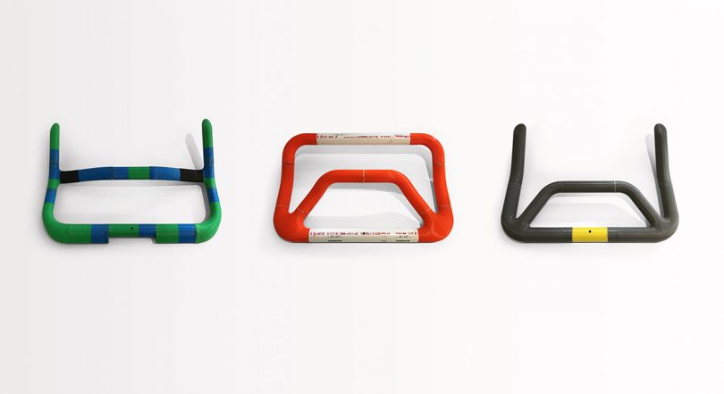
Let’s talk about the bullhorn handlebars. They’re integral for rider comfort and also the sensation/perception of riding a real bicycle. How did your team come to the eventual final shape and configuration?
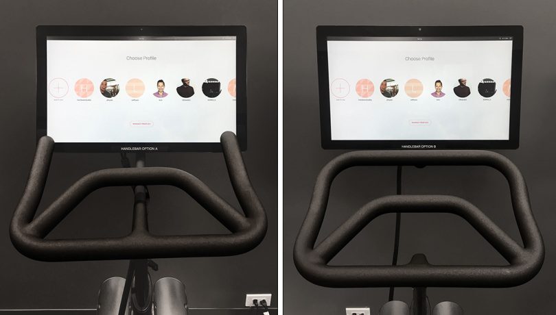
A lot of our decisions revolved around how the handlebars would intimately integrate in coordination with the screen. We must have made – I don’t know – 50 prototypes of not only different kind of form factors for the handlebars, but also mock-ups for the purpose of discovering the optimal angle position.
That’s interesting – the screen and the handlebars were designed not simply in parallel, but in direct relation to one another rather than separately to ensure ergonomic integration? The screen wasn’t just tacked on.
Of course, we still have to develop a tablet that is beautiful, and all of that, but it can’t be done in a silo. It has to be done as part of the entire system.
How did the team determine which controls would remain tactile versus accessible using the screen?
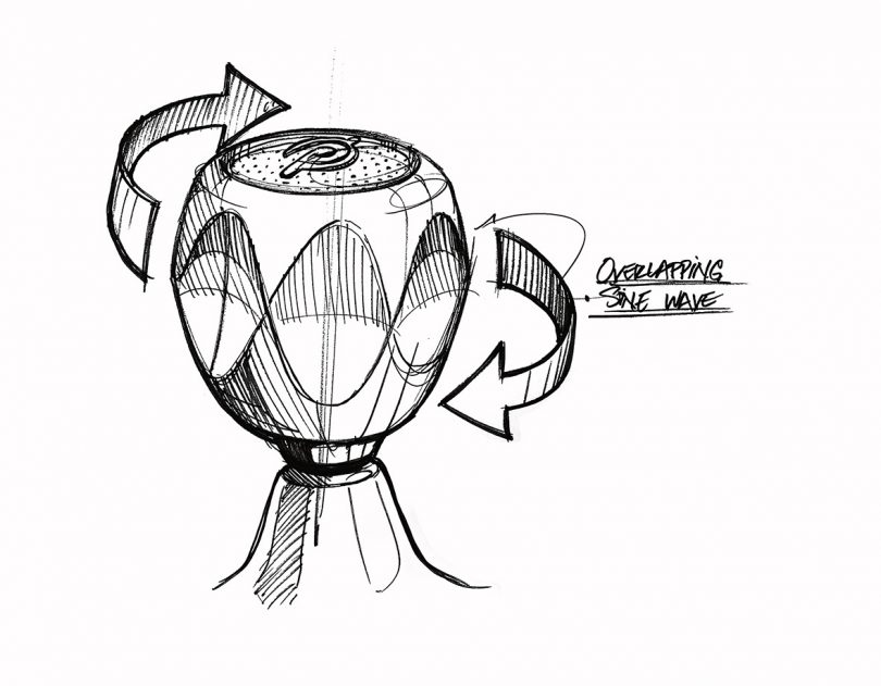
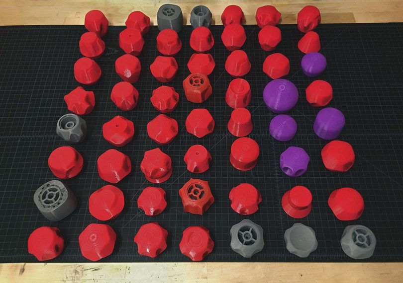
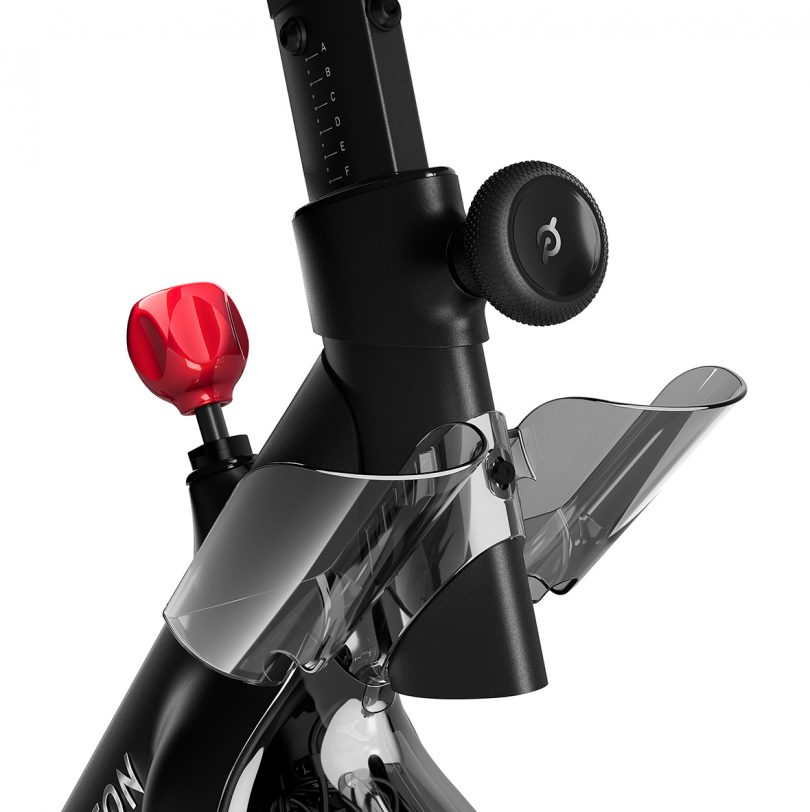
The basis of all of our design decisions begins with seeking the essence of the product. We love the interaction between human and machine. For example, the interaction of physically changing the resistance using the knob. It’s so important to feel physically engaged with every aspect of the workout. The dial is a main touch point, the essence of the bike itself. We have buckets and buckets and buckets of knob designs. It was a point of obsession, as we saw the knob as a means to communicate a visual design language DNA through one simple object. [The knob] is a statement piece, a jewel-like touch point for the user to feel physically engaged with the brand.
But we also thought about our users when they’ve been sweating hard for 45 minutes, when they might not have great articulation in the hands. Navigating a UX/UI with fine motor movements then might not be realistic. So we thought of designing in big, sloppy “I’m tired” gestures so anyone can easily throw the knob left and right [to adjust difficulty].
The cool thing with Bike+ is now that adjustment can be automated; riders have the option to adjust it themselves or have the program adjust it up and down for them, which is super, super cool. I never thought I would like it as much as I do. It’s a really cool automated feature that allows the rider to go back and forth between digital and analog as needed.
Pulling out to a big picture perspective – the gym equipment sector has traditionally been apt to change slowly, incrementally. Gym machines from 10 years ago are mostly the same. Does Peloton see itself changing designs at a pace similar to the tech sphere rather than the traditional exercise equipment industry?
The version one Bike has had a really strong life. It was announced back in 2012 on Kickstarter and began selling in 2014, and it’s still on the market today. Since then we’ve refreshed the tablet, and we also launched Bike+. When we were designing Bike+ we began with a love for the original frame. When we began, we thought, “We’re not going to touch the frame.” But we did touch every part of the Bike+ frame; we ended up modifying it incrementally through the design process.
We don’t have anyone from the fitness space within our design team. I worked for 10 years in the housewares industry. I used to design spoons. I also used to design large objects and diagnostic equipment and medical equipment. How do you go from spoons to designing bikes? But I think the parallel across all categories is materiality and design can kind of transcend product, allowing designers to be able to jump from one vertical to another.
We actually don’t have anybody from the fitness space. We have people who were shoe designers for Reebok, CMF designers from Logitech, Microsoft, and Nokia. Ex-Googlers. People from Steelcase. A super diverse and very talented team.
But to answer your question about how Peloton sees itself, we don’t necessarily consider ourselves a fitness company. We see ourselves through the lens of being a tech company, a content company, and creating a Peloton experience. Our goal isn’t just to continually proliferate into new categories, but to focus upon guiding, coaching and engaging with our members via the Peloton ecosystem. It represents the literal evolution of product within Peloton from something just in terms of simply industrial design to something more accessible in comparison to the rest of the industry. So we will continue to try to simplify the experience – equipment and software – down to its barest elements while also continuing to improve the UX/UI of the interactive screen.
For more information on Peloton, visit onepeloton.com.




0 Response to "Buckets and Buckets of Knobs With Peloton Head of Industrial Design Jason Poure"
Post a Comment