Glossier’s Los Angeles store takes cues from Hollywood studios
Encrypting your link and protect the link from viruses, malware, thief, etc! Made your link safe to visit.
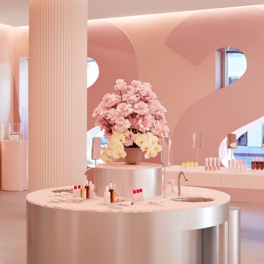
Oversized signage, large props and pink hues feature in Glossier's new location in Los Angeles, designed by the beauty brand's in-house team.
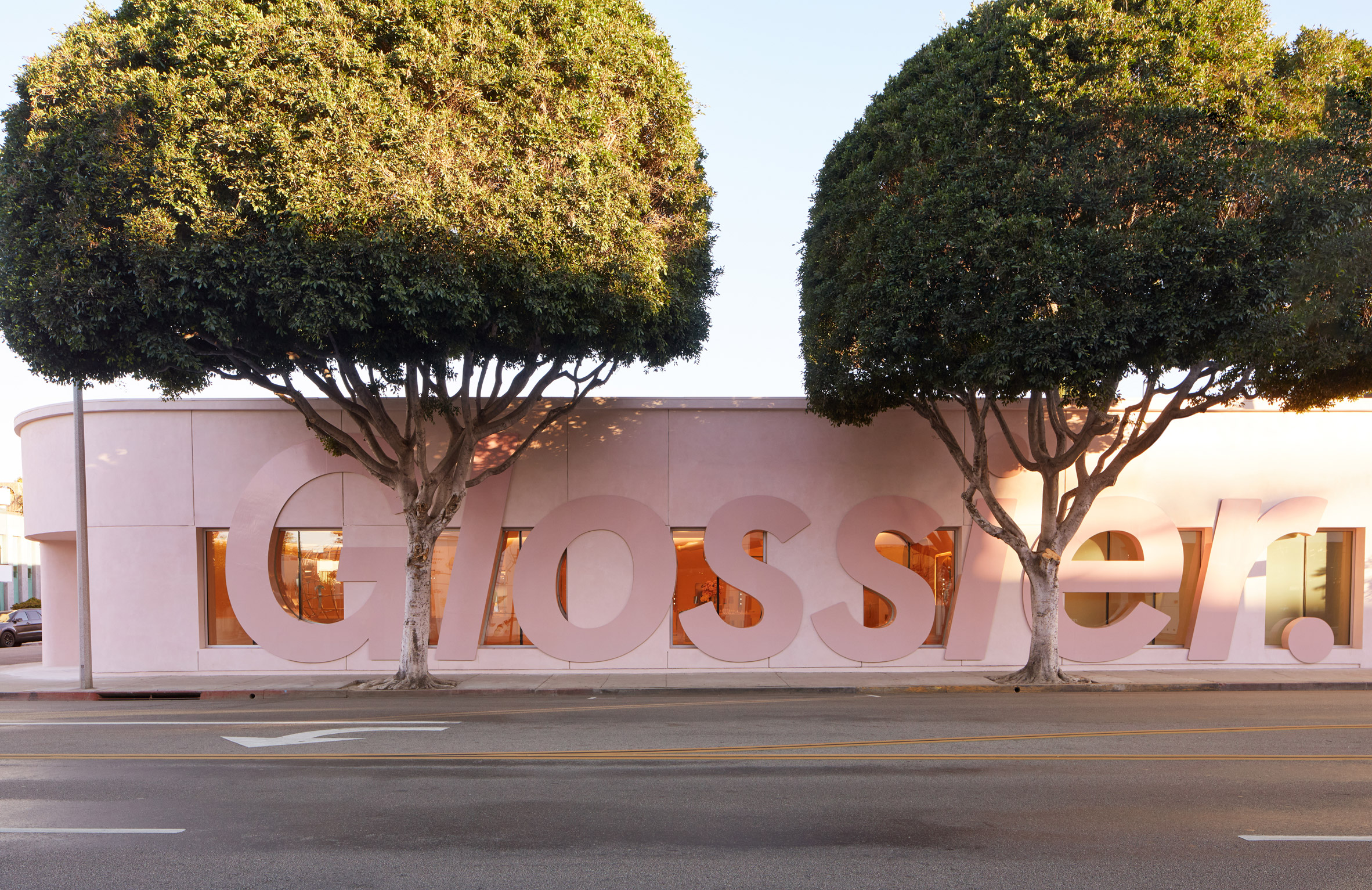
L-shaped in plan, the store stretches along Melrose Avenue and West Knoll Drive in West Hollywood. It sits a few blocks from Glossier's former LA store, which was shuttered in 2020 due to coronavirus.
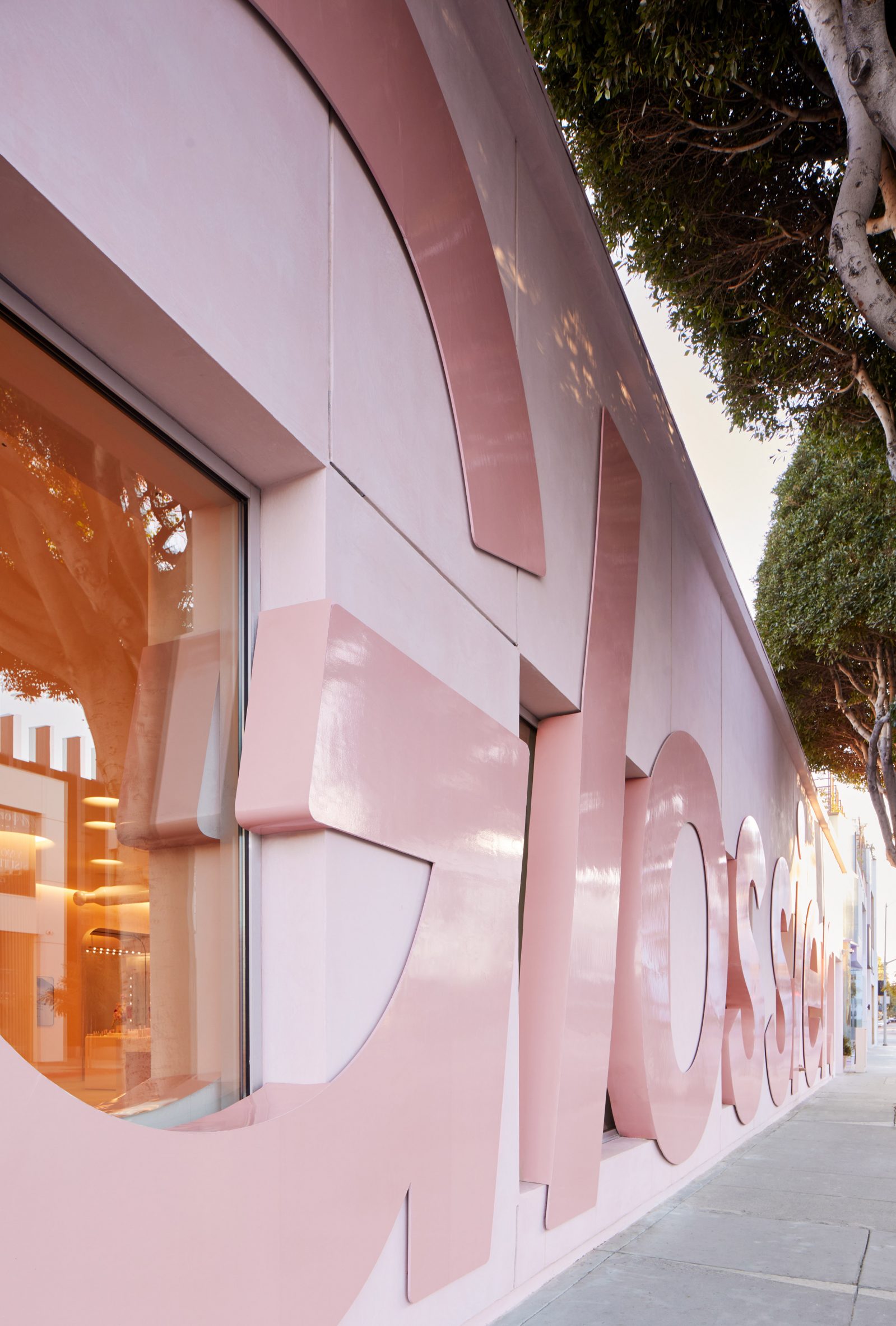
For the new space, the company's in-house design team turned to classic Hollywood studios for inspiration. The first reference is visible on the shop's eye-catching exterior.
"Taking up almost the entire block, the store features gigantic, billboard-like Glossier lettering on its facade – the Glossier version of the Hollywood sign," the team said.
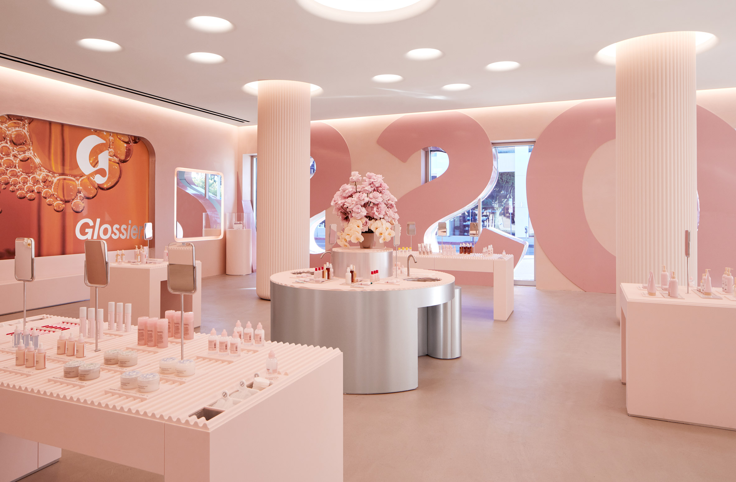
The designers also made sure to incorporate the brand's signature pink hues.
"Pink is our brand colour, and though the shade varies per store based on what fits the space and concept best, we always include it in our palette," the team said.
The LA store contains three distinct areas, each with product displays and bespoke elements.
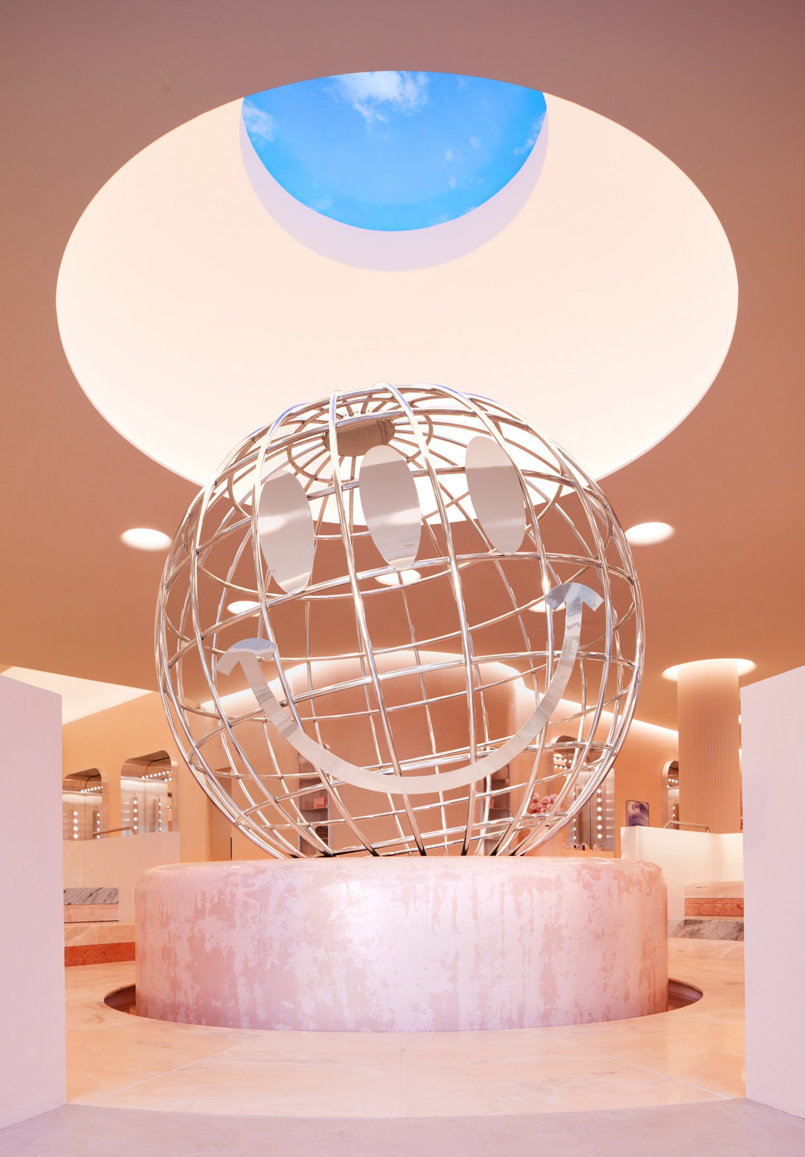
Upon entering, visitors encounter a large globe made of polished chrome and set atop a rounded podium. Up above is a circular opening cut into the ceiling and topped with an oculus.
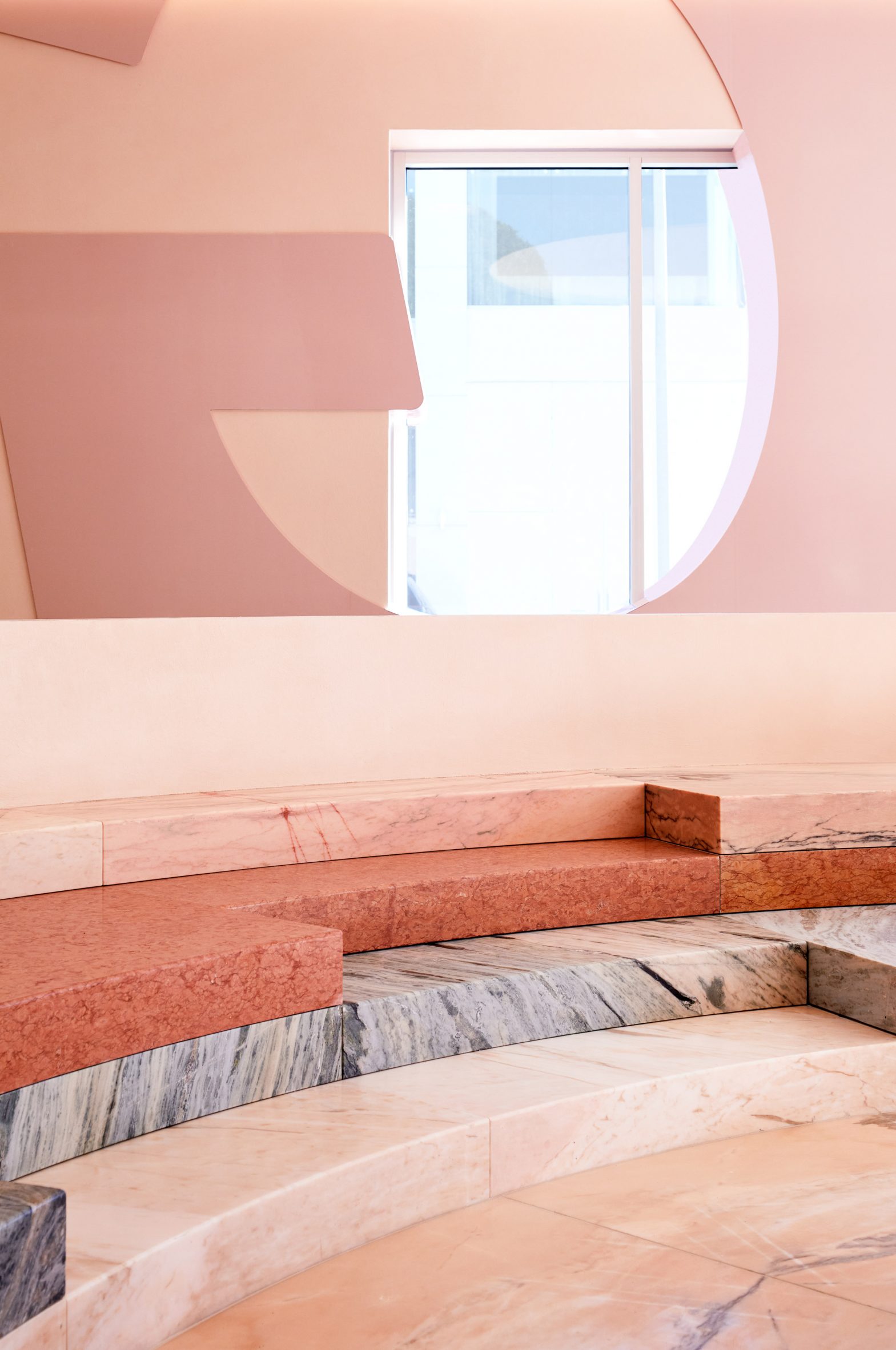
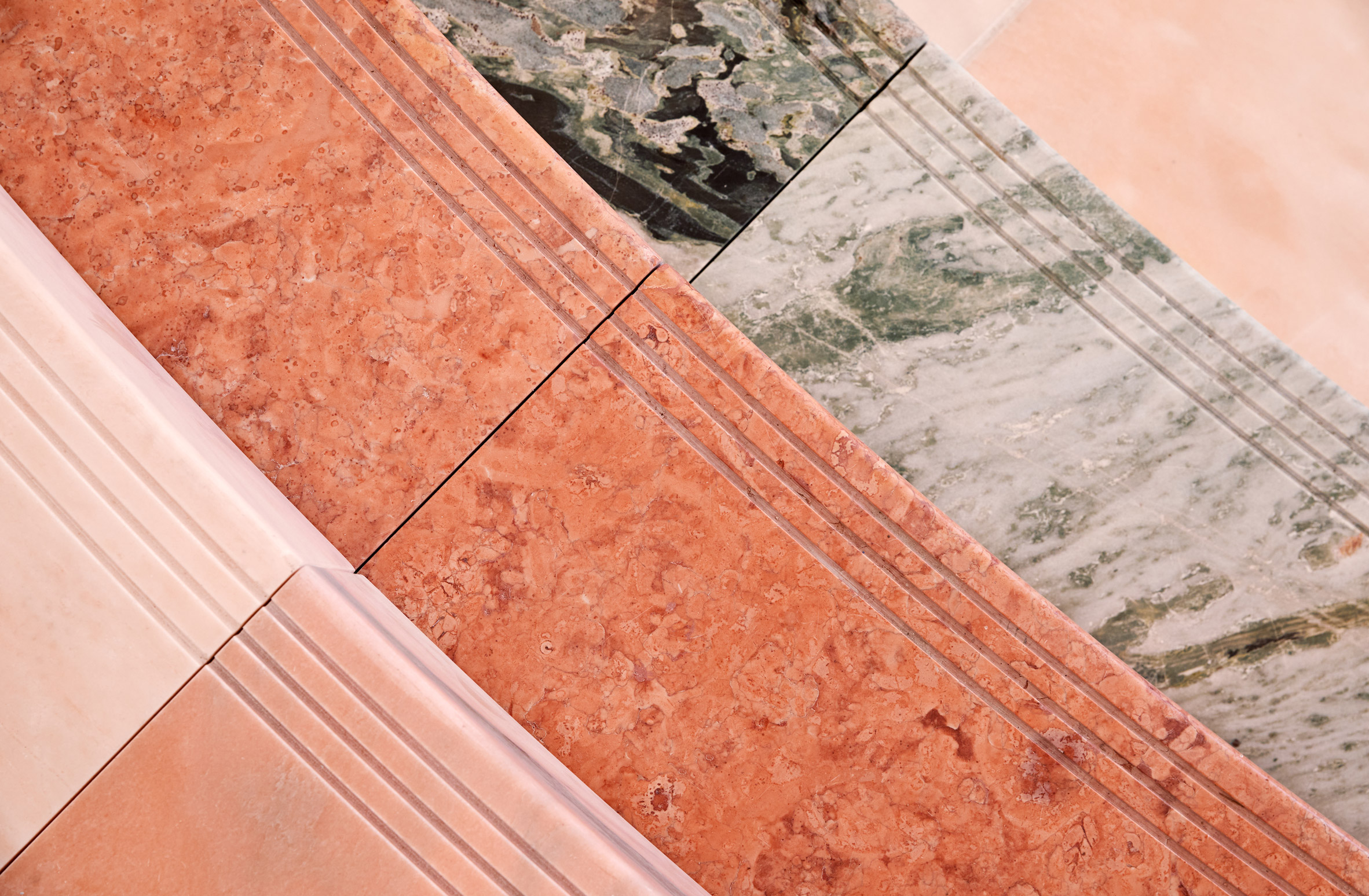
Surrounding the "Glossier Globe" is amphitheatre-style seating made of three types of Portuguese marble in pink and grey hues.
"Marble was an important material in the design of the space, giving it a sense of monumentality and permanence while still feeling like an inviting communal gathering space," the team said.
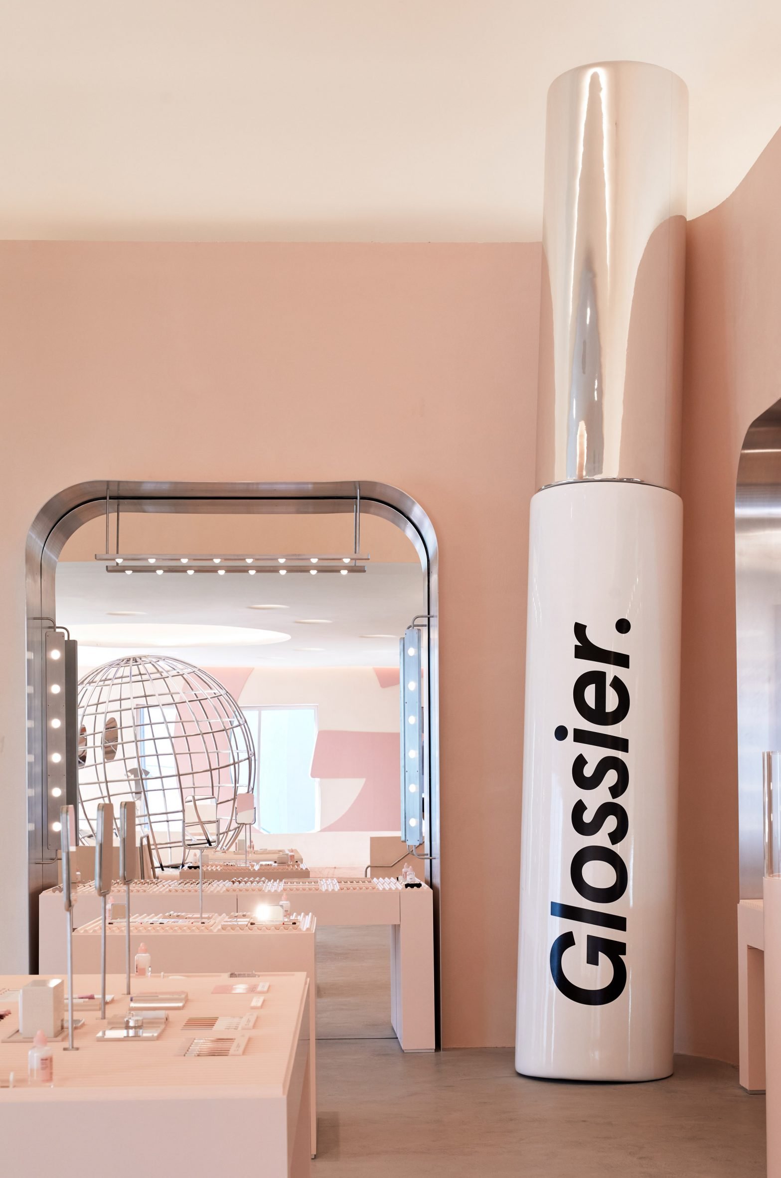
Beyond the entrance are two product areas. One is square-shaped and features an 18-foot (5.5-metre) ceiling and makeup testing tables, complete with Glossier's signature "You Look Good Mirrors".
Standing in one corner is an enormous rendition of a grooming pomade, called Glossier Boy Brow, that nearly reaches the ceiling.
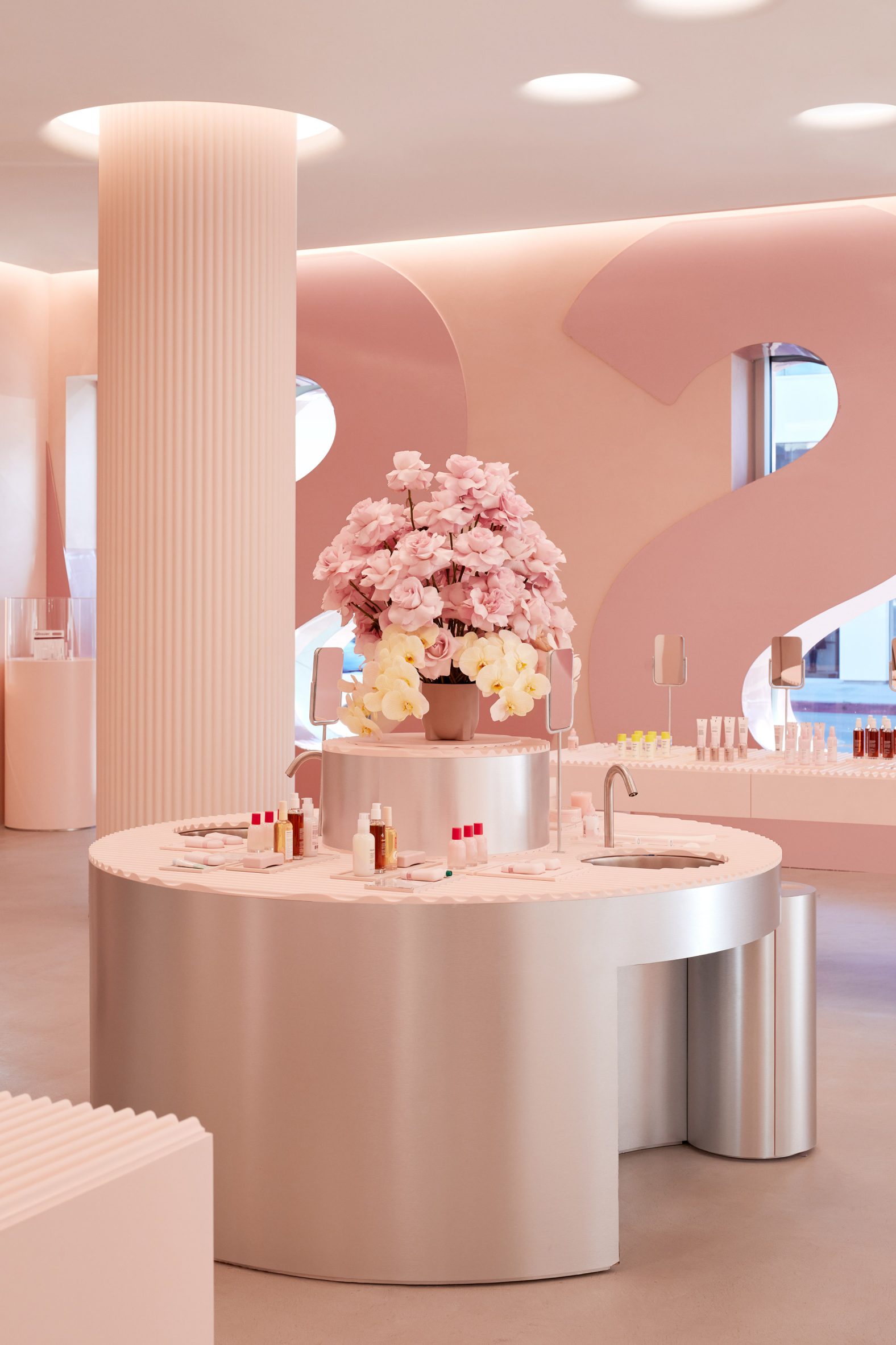
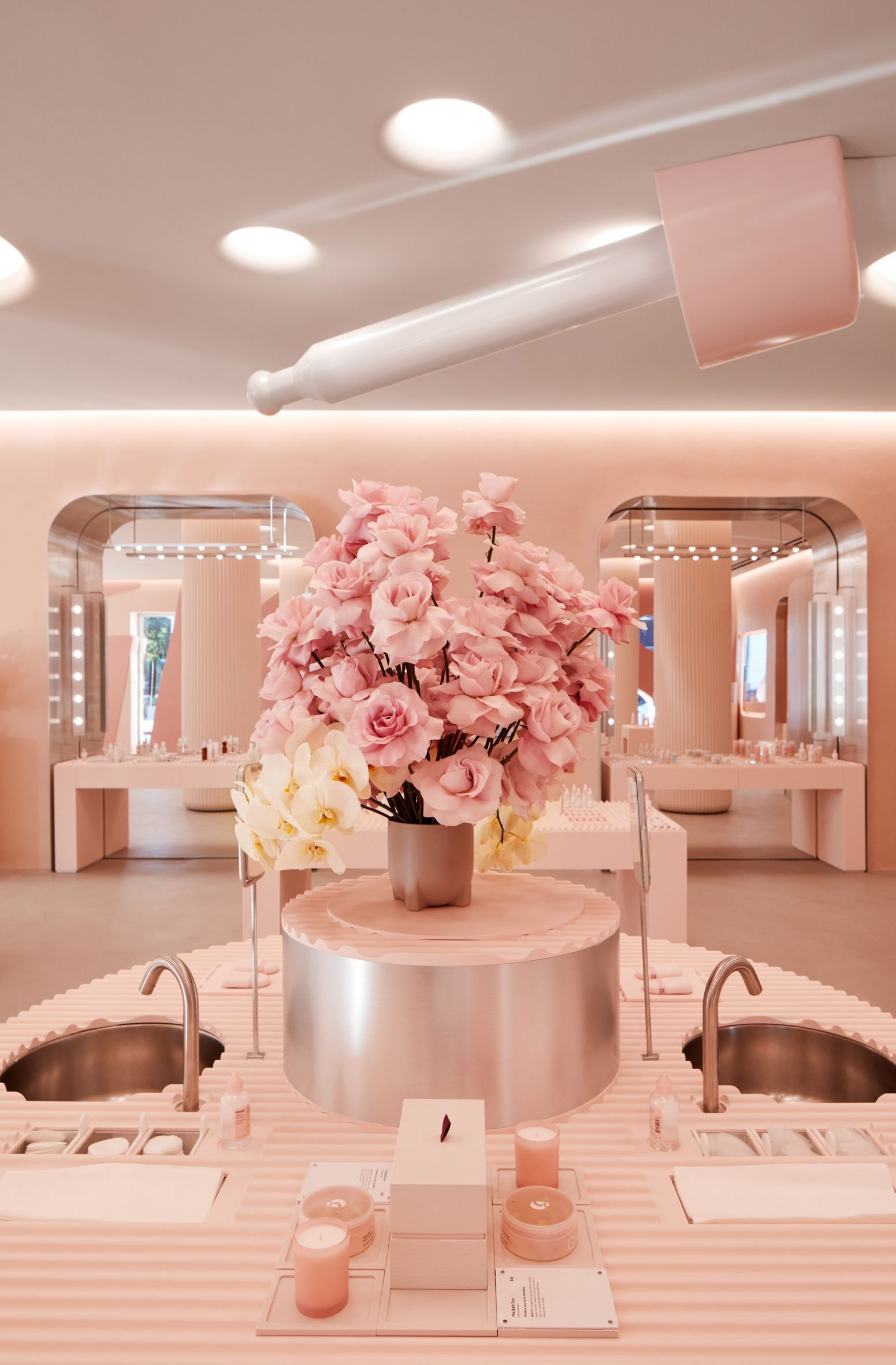
The other product zone features pink counters with skincare and body products. In the centre of the room is a circular "wet bar" wrapped in brushed aluminium – a material meant to contrast with the store's plastered walls.
Other design elements inside the shop include concrete flooring and a floral arrangement by Brittany Asch of LA-based Brrch.
"Her work is beautiful, artful and modern – and melds really well with our spaces," the team said.
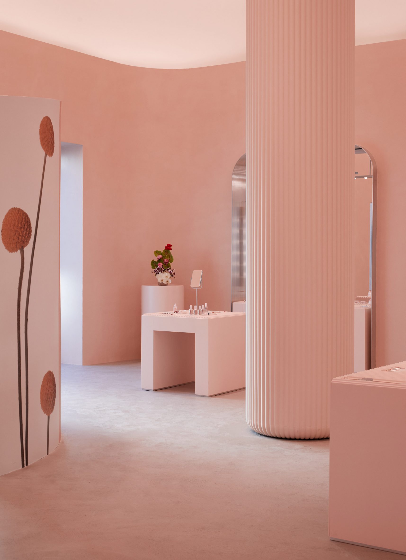
The store also features non-structural, fluted columns made of cast fibreglass. The columns rise up through a dropped ceiling with round cutouts.
Passing through the openings is ethereal light from LED fixtures with custom brightness and temperature settings.
The store has no traditional checkout counters. Instead, customers tell a roaming staff member, called an Editor, which products they would like to purchase, and the information is entered into an iPad.
"Guests' names are then called and they are invited to pick up their order from a counter that is toward the back of the room," the team said.
The shop also has an outdoor area called Glossier Alley, set to open this month. The space will be stocked with lush topiaries, a coffee bar and cafe, and a large surrealist marble fountain created by local artist duo Haas Brothers. The company plans to offer concerts, farmers' markets and other events in the space.
Launched in 2012 as an online company, Glossier opened a shop two years later, located within its New York headquarters designed by Rafael de Cardenas. In 2018, it unveiled a three-storey store in Soho designed by Gachot Studios and PRO. It also has created a number of pop-up shops.
After shuttering its brick-and-mortar locations in 2020 due to the pandemic, the company is starting to reinvest in its physical presence.
This past summer, it opened a permanent store in Seattle adorned with pink decor and a sculpture that sprouts artificial mushrooms. The company will open shops in London and Miami within the next few months.
The company prides itself on taking an experimental approach to its shop designs.
"As a digital-first company, Glossier has had the freedom to be experimental in retail," the team said. "Our stores have never been about just selling products, but inviting everyone to participate in a new kind of beauty experience – one that facilitates people-first beauty discovery, and Glossier, in 3D."
The photography is by Glossier.
The post Glossier’s Los Angeles store takes cues from Hollywood studios appeared first on Dezeen.


0 Response to "Glossier’s Los Angeles store takes cues from Hollywood studios"
Post a Comment