Reflections and shadows define Los Angeles Apple Store by Foster + Partners
Encrypting your link and protect the link from viruses, malware, thief, etc! Made your link safe to visit.
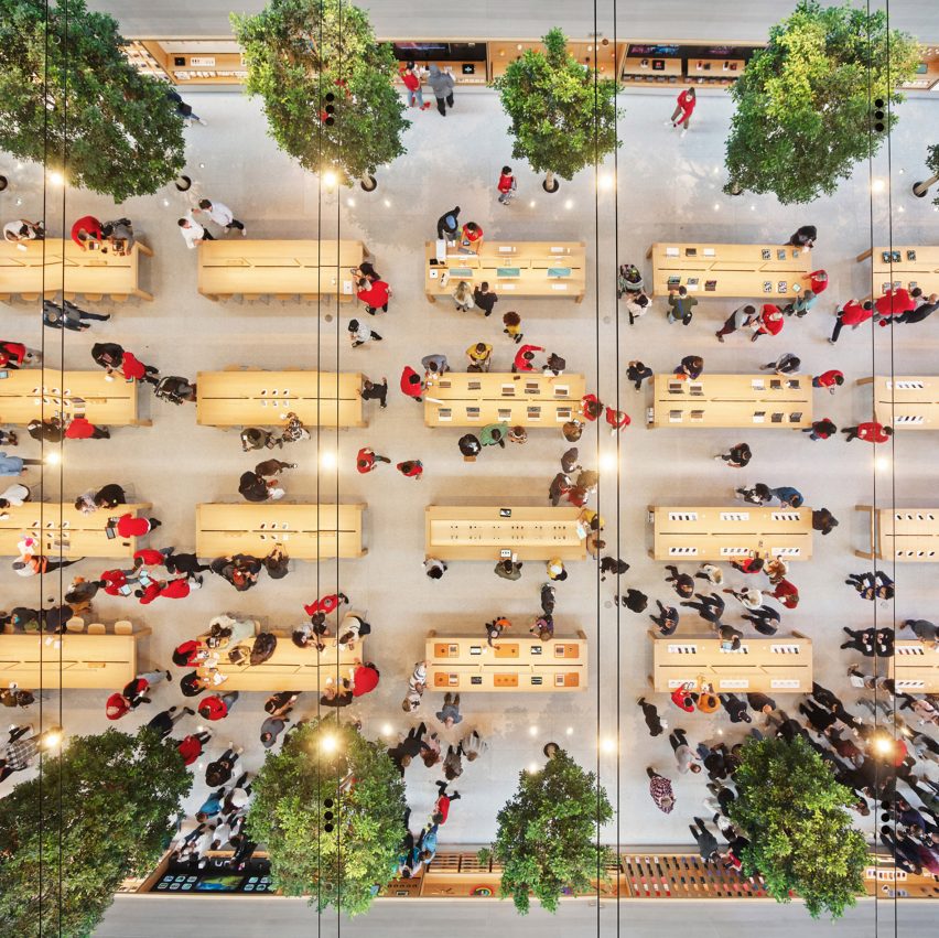
Architecture studio Foster + Partners has designed an Apple Store in Los Angeles as "a dynamic hall of illusions" amplified by a mirrored ceiling that reflects rows of indoor trees.
The single-level store, which replaces an existing structure, is located at The Grove, one of the city's prominent shopping centres adjacent to affluent neighbourhoods Beverly Hills and West Hollywood.
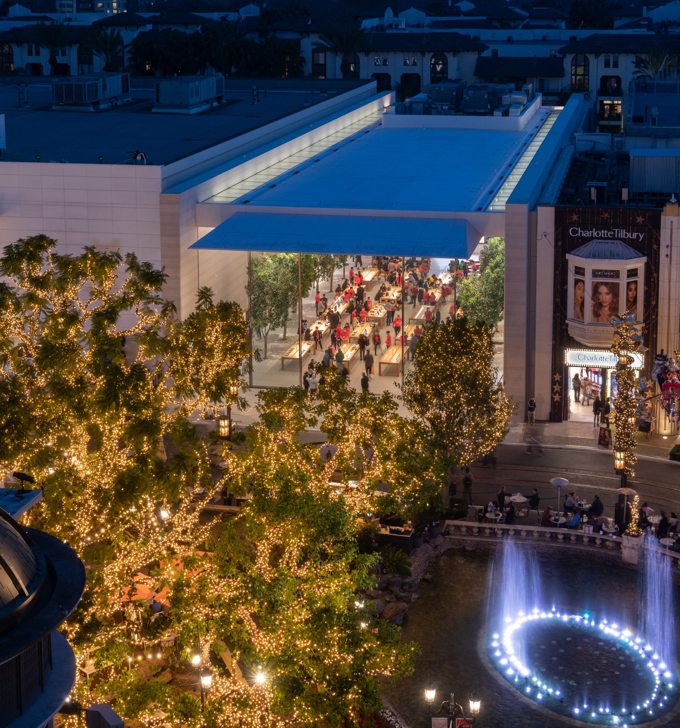
Measuring twice the size of the site's original structure, the new store for technology company Apple is a triple-height rectilinear building positioned in an open-air plaza.
A large glass facade was designed to enhance a sense of community both in and around the shop. This has been fitted with two three-metre-by-10-metre sliding doors that will allow the store to be naturally ventilated for large portions of the year.
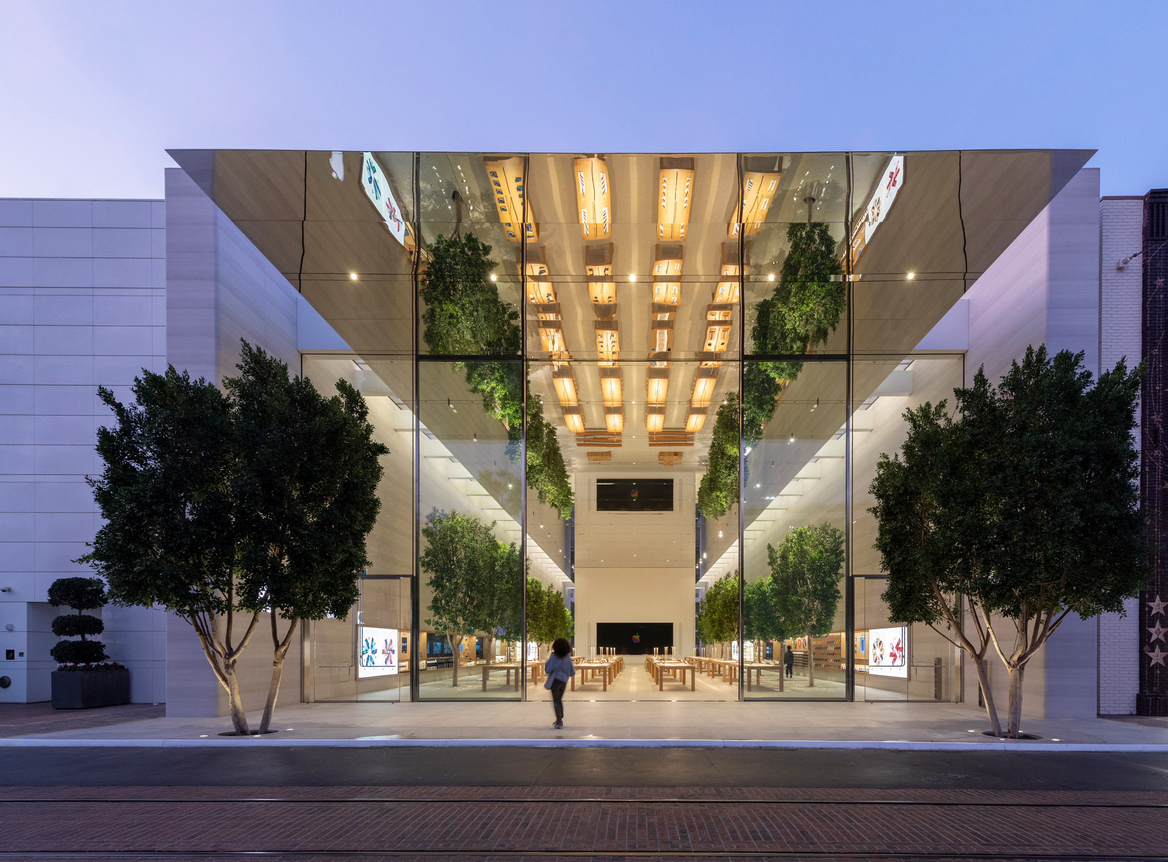
This accessibility is also reflected in the Apple Store's two entrances, as visitors can arrive at the shop from directly inside The Grove or at West 3rd Street where they are greeted with an area dedicated to picking up Apple products.
Skylights flood the store with natural light from above, where white beams support an expansive mirrored ceiling made from specialised stretched fabric and cast dramatic shadows on the Castagna stone-clad walls that flank the interior space.
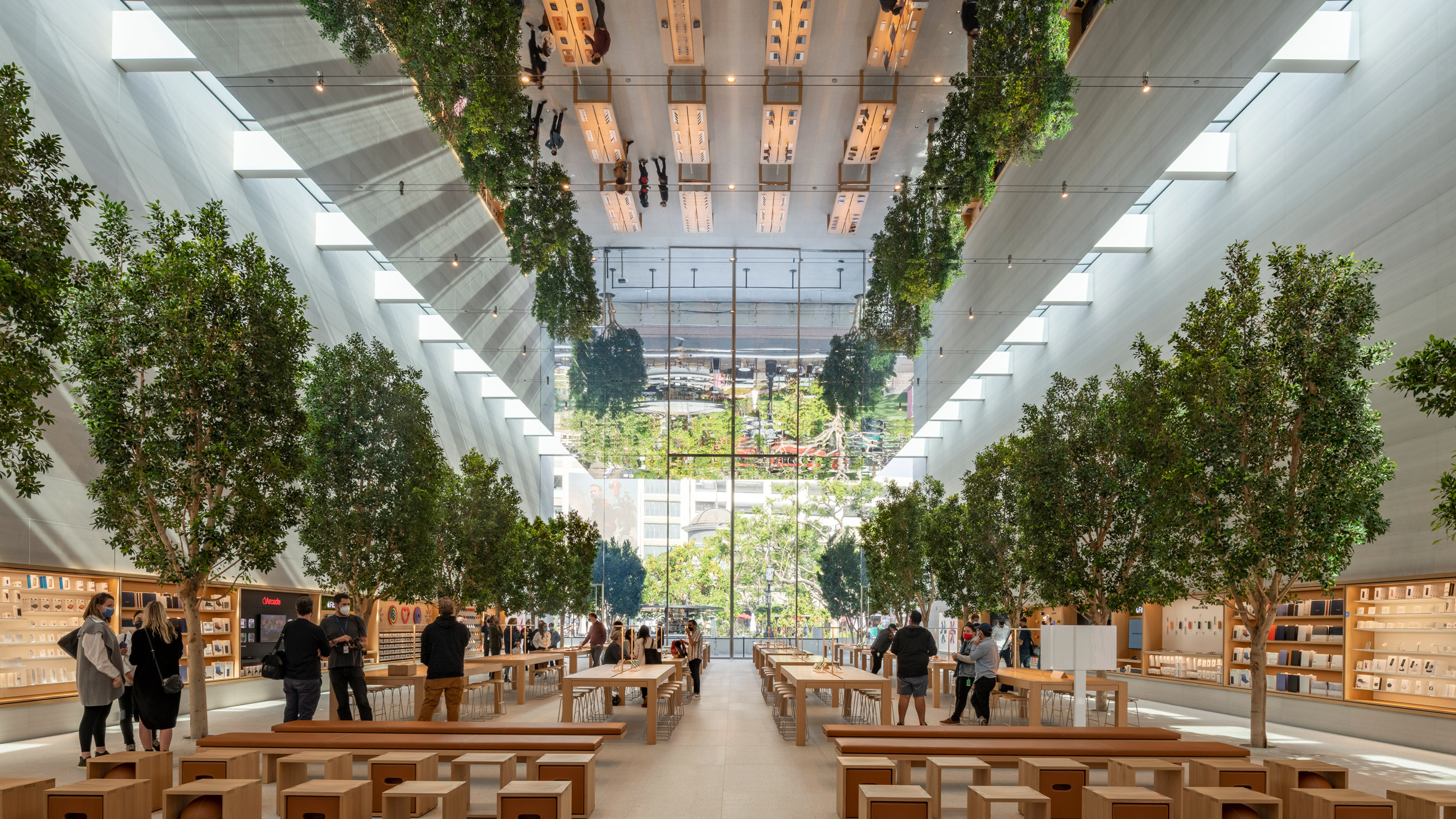
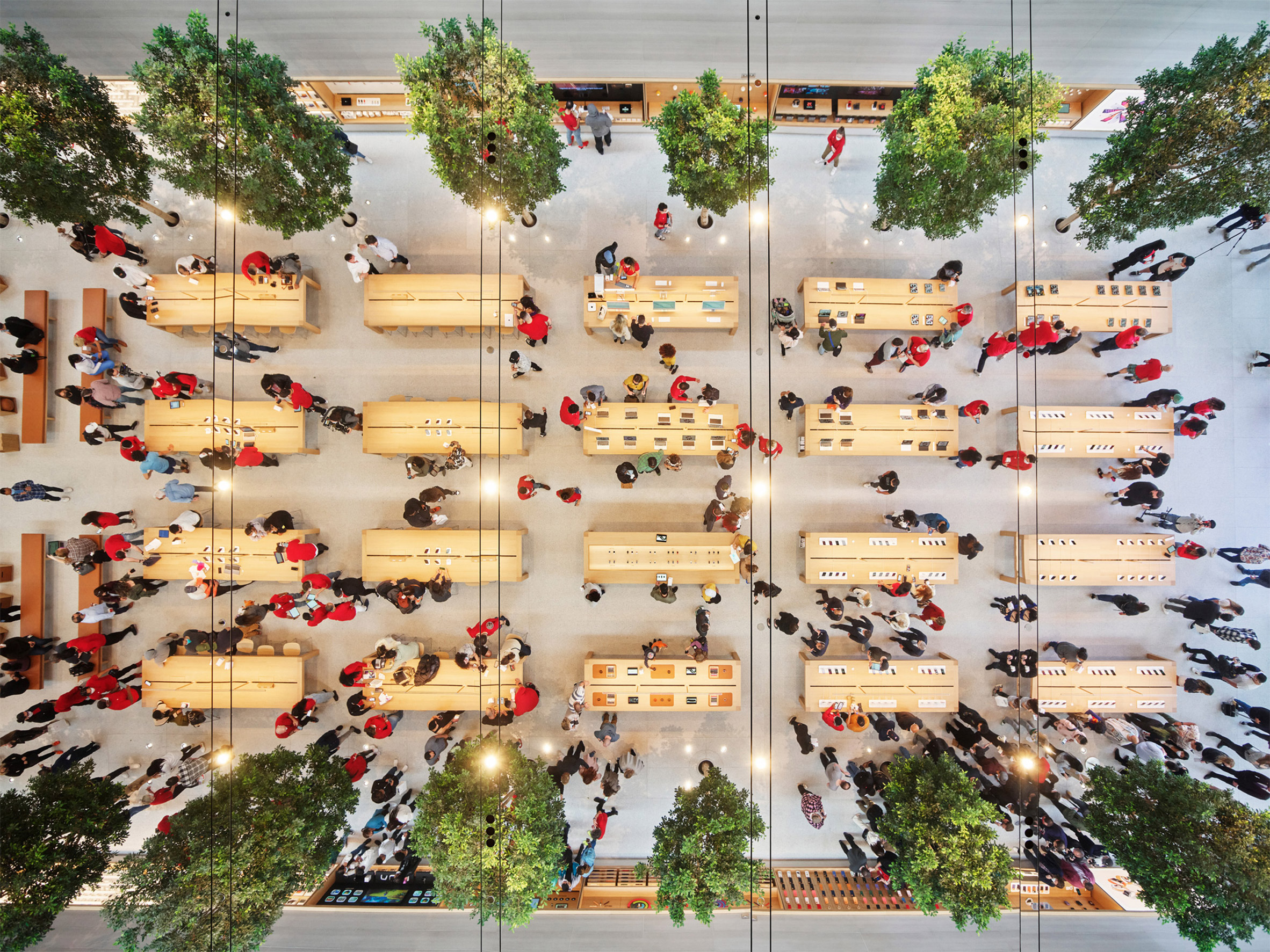
The statement ceiling reflects rows of light-coloured wooden tables set up for product consultations, often considered a staple of Apple Stores.
"Apple at The Grove is a dynamic hall of illusions that captures the vitality of Los Angeles," said Foster + Partners.
Also reflected in the mirrored ceiling – which the architecture firm said was Apple's first – are two parallel rows of eight ficus trees.
"The trees make their way through the building onto the edge of West 3rd Street, establishing biophilic links and creating a lush, inviting atmosphere," explained Foster + Partners.
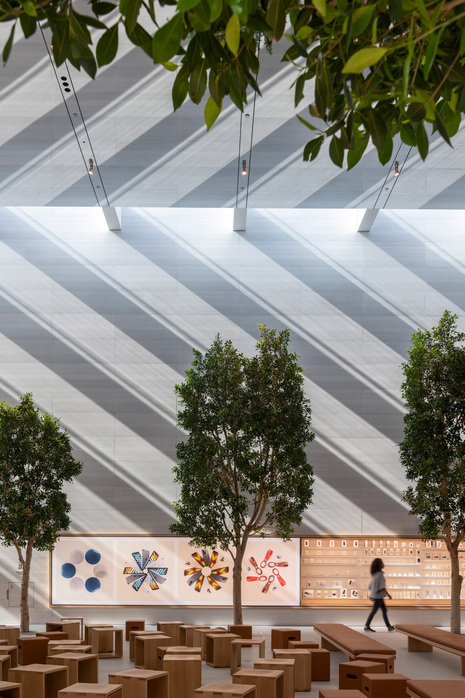
Lengthy displays of Apple products line the space's stone walls, while a large presentation screen surrounded by benches sits at the far end of the store.
"The design is rooted in its locality, while also addressing the rich history of motion pictures in the city," added the studio.
British office Foster + Partners has designed numerous other Apple Stores. These include the recent Apple Tower Theatre, another project in Los Angeles located in an abandoned 1920s theatre, and a minimal Istanbul store also flanked by two stone walls.
The photography is by Nigel Young and is courtesy of Foster + Partners.
The post Reflections and shadows define Los Angeles Apple Store by Foster + Partners appeared first on Dezeen.


0 Response to "Reflections and shadows define Los Angeles Apple Store by Foster + Partners"
Post a Comment